Showing posts with label Graphic Design. Show all posts

2 October 2014

The Shedley

http://playfordspast.blogspot.com.au/2013/10/the-civic-theatres.html
Image Source Here >
Built in 1965, The Shedley Theatre is a long standing icon in Elizabeth, and was recently upgraded to incorporate a new cafe and bar. I worked alongside The City of Playford's Marketing Department to develop a new brand for the Elizabeth Civic Centre's Café space.

The brief was to somehow incorporate the original 1960s Shedley sign into the new brand, keeping it fresh and not in your typical council style!

I managed to reproduce the original Shedley sign into a logo file, and introduced a new element - a complimentary 'octagon' starburst graphic to use on its own for stickers, uniforms and other marketing.

Interior Design by Total Space Design
It was also a requirement that all designs complimented the new interior design by Total Space Design.

This was such an awesome job because I love the fact that this brand was inspired by the building's history and elements from the 1960s, including starbursts, Featherston Chairs, red bricks!

30 July 2014

Happy Ethel!


So pleased to see that E for Ethel are happy with their new logo and website that I designed for them. Hooray!

25 June 2014

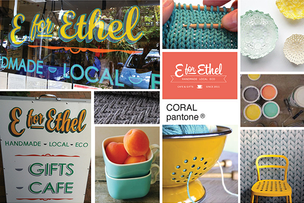
A fresh face for E for Ethel

I've just completed a brand refresh for my lovely friends Dan and Amanda from Adelaide cafe and gift store "E for Ethel". The design brief was to retain some text elements from their existing logo, and also compliment the look and feel of their newly handpainted window and street signs.

I included a pattern of knitting in the logo set, and kept the tea cup element to link the visual message back the two distinct sides of the business, cafe and hand made products. View all elements of the brand set here>. An enjoyable job to work on with the most gorgeous couple. Now onto the E for Ethel Website!!

beforeafter-01
Toodle-pip,

13 January 2013

'Up We Pop' Logo Design

This week I was asked to design a logo to use on printed, online marketing materials and a shop window for One Small Room's 'Up We Pop' Shop. The key was to create a design that worked with the existing OSR brand, but also something that portrayed the style and products of OSR, and the 'pop up' shop concept overall.
Considering OSR specialises in vintage industrial and upmarket design, I decided to create a logo that had a vintage sign look and feel about it.

Inspiration from Modern 50
I decided to create a bold logo that would work well overlaid onto photographs as well as a window graphic. Incorporating the One Small Room web address into the logo helped to link it back to the One Small Room business for situations where this logo was used as a separate entity.

Initial Concepts

Colour choice was easy once a background image was selected for the email and postcard promo. The vintage green worked well with the finished logo -simply inspired by the green book on the desk!

Postcard and Email Design
Printed Postcards (Photo - Denis Smith Photography)
The Shop Window - finished result. (Photo - Denis Smith Photography)
I am very happy with the end result, and more importantly so are Bek, Tim and Georgia from One Small Room. A fun way to start the 2013 working year!
If local do check out this awesome space at 20 Ebenezer Place, Adelaide. 
Toodle-pip,
Related Posts with Thumbnails