Showing posts with label Websites. Show all posts

10 October 2014

Not only One Small Room

www.onesmallroom.com.au
The original idea for One Small Room (OSR) was to set up a room with lots of special pieces chosen for their quality, uniqueness, style and soul, all displayed in a retail space just as it would be in a home.

Ten years later this idea has now evolved into a multifaceted business specialising in interior, building and product design, prop hire and styling – and the original OSR retail space in Croydon, Adelaide is still a popular stop for lovers of all things vintage and retro!

My design brief was to create a clean and feature full website for One Small Room, something to simply promote the two sides of the business – Retail and Design. Rather than manage an online shop, OSR wanted to have a simple way for customers to enquire about a product, so a sophisticated gallery and pop up form was developed to suit this requirement.

The project was completed with crisp professional photography by Denis of Smith & Collins, working alongside Stylist Rebekah Cichero of One Small Room. Some behind the scenes pics...
Bek and Denis churning out the styled product photos.
Behind the scenes setup at the OSR Hall. Impressive!
Toodle-pip,

8 October 2014

Surface Art Spring 2014

www.surfaceart.com.au
Some may find this quite scarey seeing 6 of me in one place, it freaks me out a little. But putting that aside, check out the first roll-out of Surface Art's new Spring / Summer range for 2014!

Oh and also thought I would mention website design by Kyrie Design Studio! ;)

15 September 2014

Feeling Responsible

I was chatting to a friend the other day who was telling me about their recent experience with having a business website developed. So I jumped on my iPhone while on the run to check out her new online digs and was really disappointed to discover that her new site is not "Responsive".

So what does this mean?

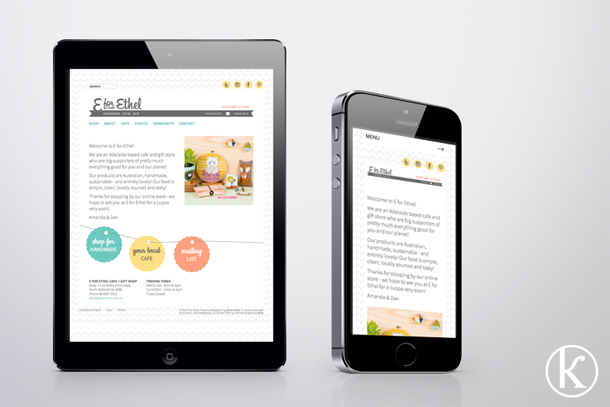
Well in website terms a Responsive website design takes into consideration all screen sizes that the site may be viewed on. For example tablets/iPads, iPhones, laptops - basically big and small screens on any hand held or desktop device. When viewed on different screens the website should cleverly (and subtly) change layout to make the overall viewing, navigation and scrolling experience easier. (here is the long definition on Wikipedia)

ipad_phoneblog
So considering how many gadgets people will potentially view your site on, it is recommended that you make sure Responsive design is on your website wish list. Actually I would expect this to now be a standard feature of website development, so do check or ask the question when gathering website quotes.

30 July 2014

Happy Ethel!


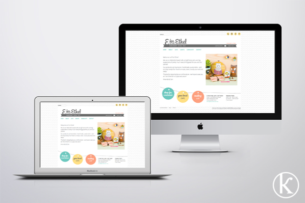
So pleased to see that E for Ethel are happy with their new logo and website that I designed for them. Hooray!

2 August 2013

shop in your ugg boots!

It's totally acceptable to stay in your ugg boots... we now offer FREE SHIPPING for all orders within Australia! Shop from the comfort of your own home with a cup of tea in hand! 

Check out our online store - www.messagemark.com.au

Toodle-pip,
Related Posts with Thumbnails